Showing posts with label ColourQ. Show all posts

Wednesday, September 5, 2012

Less is More and ColourQ

I'm sharing cards for two different challenges today.

First up is the card I've made for Less is More 83, where the challenge is to use brown and pink.  I've used PTI out on a limb with Memento rich cocoa and Victorian velvet distress ink.  I added liquid pearls to the center of each blossom.  I tried both a cream and a brown card base, and can't decide which I prefer.  Opinions?


Second, I've made a card using the absolutely gorgeous color palette from ColourQ 153.  Isn't this beautiful?


I used PTI floral frenzy to stamp a background pattern around my sentiment.  For colors I've used Memento rich cocoa and cantaloupe, VersaMagic pink grapefruit, and ColorBox robin's egg.  These colors make me so happy. :)


Thanks for visiting today!

Ann

Saturday, June 30, 2012

ColourQ 143

I'm playing along today with some new stamps that I purchased with a $25 gift certificate from Make-it-Monday 65 and some birthday money.  This is the first time I've had PTI products right after they were released.  I feel very trendy! :)

I thought the primary colors of ColourQ 143 would make a bright and happy banner.  I love this little $5 heart-2-heart set.  This card by Maile Belles is the one that convinced me to add the set to my order, and this post by Melissa Bickford, who designed the set, is the one that inspired me to make a matching tag. 

The set stamped beautifully.  I didn't purchase the matching die, but the triangles were super simple to cut out by hand for the portion of the banner that is popped up.


I've been gone a lot lately with summer visits and haven't been doing much stamping or blogging.  This afternoon we had a bit of free time and my 7-year old wanted to make cards.  We sat at the kitchen table for an hour or so playing with my new stamps.  It was lovely!

Thanks for your visit today.

Ann

Supplies:
Paper: PTI white
Stamps: PTI heart-2-heart #5
Ink: Memento Bahama blue, ladybug red, London fog, Brilliance yellow


Friday, June 22, 2012

Bordered Sentiment Cards

Last night I made a couple of cards for several challenges.  Both of them use the bordered sentiment technique described at PTI's Make-It-Monday.  The first card is a simple one-layer card also inspired by Less is More (something shiny) and One-Layer Wednesday.

The One-Layer Wednesday challenge, hosted by Heather Telford this week, is to make a card inspired by something in your kitchen.  I opened the pantry door and the first thing that jumped out at me was my daughter's water bottle.  It's been at school on her desk all year, but since Wednesday was the last day of school, it's back at home now.  I was inspired by the circle designs on the bottle as well as the colors.


I added bling to some of the circle images, so it also qualifies for the Less is More challenge to use something shiny.  I don't always know what to do with bling, but I love it on this card!


I made a second card using the colors from ColourQ challenge 142.  I have to say I never would have put these colors together, but I love them.  I used the same layout as the Make-It-Monday sample card.  Stamps are PTI Mehndi Medallion, which is one of my favorite sets.  I used some white ric rac, but in the morning light it looks much creamier.  I liked this card better last night at midnight! :) 


I tried it mounted on both white and dark blue.  Which do you prefer?

ColourQ Inspiration:

Friday, June 15, 2012

Shikepoke Cards

I've made two Father's Day cards using the Wplus9 guiding light set.  I think I bought this set just so I could make cards for my dad using the heron image, so it's strange that until now, I've used all the images from the set except for the heron. :)

Now I've put that little heron to good use.  For both of my cards I cased this beautiful card from Sea Glass & Sentiments.  I've also used the beautiful colors from this week's ColourQ challenge on my first card.  The picture doesn't show it well, but one of the buttons is actually green.


Living by the water as we do, great blue herons are everywhere.  We love to watch them standing as still as statues along the shore.  I spent a large portion of my childhood on a small island in Puget Sound where there are also many herons.  My dad often called them "shikepokes."  I've never heard anyone call them that except for him.

Out of curiosity, I Googled shikepoke and the first thing that came up was a Wikipedia article about herons.  There are two interesting paragraphs about the origination of the term shikepoke.  Check it out here, if you're interested. :)

Thanks for your visit today.

Ann

 ColourQ Inspiration:

Saturday, June 2, 2012

Pocket Cards

I loved the Make-It-Monday video at Capture the Moment this week.  It is all about making pocket cards, which is something I've never done before.  I played around and made three different pocket cards a few days ago, but am just now getting to blogging them.  I think these would be fun for invitations or for giving gift cards.


It's interesting to me how the french blue ink took on more of an aqua color on the kraft cardstock.  On the white I had to switch to robin's egg blue to match.

Supplies:
Paper: PTI kraft, white
Stamps: PTI turning a new leaf, think big favorites, Fiskars floral flair
Ink: Colorbox frost white, , french blue, robins egg, Memento tuxedo black


Supplies:
Paper: PTI kraft, white

Stamps: wplus9 guiding light, PTI think big favorites
Ink: Colorbox frost white,Memento


For this card I added a plum color to go with the ColourQ challenge this week.  I didn't have a good button to match, so my button is a little more reddish, but I'm still pleased with it.

Supplies:
Paper: PTI kraft, white

Stamps: PTI turning a new leaf, think big favorites, Fiskars floral flair
Ink: Colorbox frost white, french blue robins egg, Memento ocean depth, Versamagic perfect plumeria


Thursday, April 5, 2012

ColourQ 131

I'm playing along this week with the beautiful colors of ColourQ 131.   It's funny how everything looks different in the daylight.  Last night when I was making these, I had a hard time finding a close match for peach parfait, and I ended up making two cards using both VersaMagic pink grapefruit and persimmon. 

When I photographed the cards this morning, it's the yellow that looks the most 'off.'  In my photos it looks almost orange, which it honestly isn't.  Regardless, I really like this color combination.  It's so fresh and fun.  I used the large image from PTI Mehndi medallion to stamp a background.  The sentiment is from PTI think big favorites #12.


Beautiful Inspiration:

Thanks for visiting today!

Ann

Sunday, February 26, 2012

Less is More 56 and ColourQ 125

Just squeaking in before the close of ColourQ 125 with a card for the current color challenge, as well as for the Less is More scrap challenge.  I pulled these scraps of color from my scrap box and used them to create a pattern of stripes in varying widths, which I used to ground the bicycle images from Hero Arts Joy Ride.


My Scrap Storage


Color Inspiration:


Wednesday, September 14, 2011

Card Patterns 132 and ColourQ 102

Apparently I skipped Halloween and Thanksgiving and went straight to Christmas this week. I liked simplicity of the sketch at CardPatterns this week, and decided to use the beautiful PTI Mehndi Medallion to stamp the panel.

I started out with red, green, and pink, and then remembered the colors from the ColourQ challenge. I loved the addition of blue, but I had a hard time incorporating the gray. I decided to use gray for the two tabs on top of the panel and for the sentiment below. I'm still not entirely sure how I feel about it, but I think it's growing on me a little bit! :)


Supplies:
Paper: PTI white, blue from scrap box
Stamps: PTI Mehndi Medallion, Hero Arts sentiment
Ink: Brilliance rocket red, ColorBox


Wednesday, June 22, 2011

CFC#7 and ColourQ #90

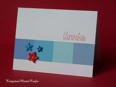
The CAS-usal Friday challenge this week is to use color blocking on a clean and simple card. I've used color blocking techniques a lot in scrapbooking, but never thought if it as a card technique! Trying to decide what colors to use, I stumbled across the colourQ challenge of using blues and red.


These colors, along with the fact that the Fourth of July is quickly approaching, had me feeling patriotic, so I set about making a card for The Fourth. This is what I ended up with. I made several attempts with stars stamped across the blocks in both blue and Versamark, but decided I liked it best as solid blocks of color. A few little star buttons and a sentiment from AMuse finished it off.


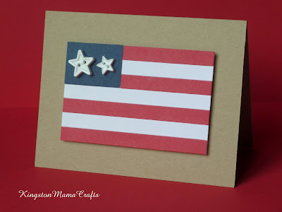
While I was making this card and feeling patriotic, I started thinking about how the American flag is basically blocks of color. I decided to see if I could use blocks of paper to make a flag card. I'm quite pleased with how it turned out. I tried stamping stars on the blue block and leaving it blank, but it needed something and again these star buttons worked perfectly.


Supplies:
Paper: PTI white and kraft, colored blocks from scrap bin
Stamps: AMuse sentiment
Ink: Brilliance rocket red
Others: star buttons from JoAnnes