Friday, June 24, 2011

One Layer Wednesday #59

Susan selected a beautiful photo as inspiration for One Layer Wednesday Challenge # 59.


I decided to use an Inkadinkado flower set that I've had for a while, but have never produced a decent card with. I stamped my favorite flower from the set in Brilliance sunflower yellow. I then masked the flower and stamped leaves from PTI Turning a New Leaf in Memento pear tart. It took five tries to get the leaves right, and I was ultimately happy with just a tiny bit of leaf peeking out to frame the flower.


The yellow and green had me thinking of lemons and limes, so I decided to play with a new Inkadinkado summer assortment mini set that I picked up for a dollar yesterday at Michaels. The sentiment that came with the set was Let's Party, but I switched it out for PTI's Enjoy the Moment.


I will definitely play with this some more, possibly moving ink colors around and adding some bling up by the sentiment, but I'm happy with how these stamped up. I only wish I had this set a couple of weeks ago when Jennifer gave us a summer-themed challenge and I couldn't find anything to work with! :)

Supplies:

Paper: PTI white
Stamps: Inkadinkado, PTI
Ink: Brilliance sunflower yellow, Memento pear tart and tangelo

Thursday, June 23, 2011

Less is More 20

The Less is More challenge this week has really had me stumped. I've never made a monogram before and just couldn't think of how I might actually use one.

I finally decided that I would make a monogram card for my husband for our anniversary next month (14 years married, 20 years together!). I kept my last name when we married, so the traditional monogram with our shared last name in the middle wouldn't work.

I was thinking of ideas using just our first initials (A & E) when I thought about initials being carved in trees, and the idea for this card popped into my head. All of my tree stamps were too small, so I found a clipart image I liked and used my craft knife to cut it out. I left the background plain because I was worried about it becoming too cluttered.


I used a brown colored pencil to write our initials and drew a heart around them. On the inside I used the computer to print 2gether 4ever. Cheesy, I know, but I think it goes well with the whole carved initials thing. Did I take it too far when I added the birds (2 little birdies sitting in a tree, K-I-S-S-I-N-G . . . )?

I've definitely worked with elementary school children for too long! :) I think I prefer the card without the birds, anyway.


This is not a traditional monogram, but LadyLIM and DivaLIM have defined monogram as: A design composed of one or more letters, typically the initials of a name, used as an identifying mark. I hope this works. At any rate, I've had fun and I now have an anniversary card all ready for next month. No more last minute card-making for me!

Supplies:
Paper: PTI white
Stamps: PTI tag-its (bird)
Ink: Memento Bahama blue (bird)

Wednesday, June 22, 2011

CFC#7 and ColourQ #90

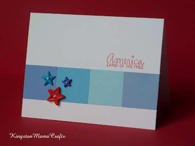
The CAS-usal Friday challenge this week is to use color blocking on a clean and simple card. I've used color blocking techniques a lot in scrapbooking, but never thought if it as a card technique! Trying to decide what colors to use, I stumbled across the colourQ challenge of using blues and red.


These colors, along with the fact that the Fourth of July is quickly approaching, had me feeling patriotic, so I set about making a card for The Fourth. This is what I ended up with. I made several attempts with stars stamped across the blocks in both blue and Versamark, but decided I liked it best as solid blocks of color. A few little star buttons and a sentiment from AMuse finished it off.


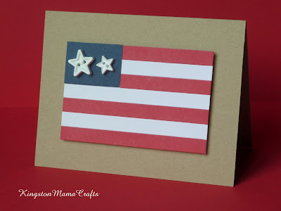
While I was making this card and feeling patriotic, I started thinking about how the American flag is basically blocks of color. I decided to see if I could use blocks of paper to make a flag card. I'm quite pleased with how it turned out. I tried stamping stars on the blue block and leaving it blank, but it needed something and again these star buttons worked perfectly.


Supplies:
Paper: PTI white and kraft, colored blocks from scrap bin
Stamps: AMuse sentiment
Ink: Brilliance rocket red
Others: star buttons from JoAnnes

Tuesday, June 21, 2011

Clean and Simple Sketch 145


I really like the sketch at Clean and Simple this week, so I decided to give it a try. I used a set of papers I picked up at Michaels a year or so ago that has just been waiting for a layout like this. I also used Floral Frenzy, which was the first PTI set I purchased.

I'm not sure how clean and simple these are, but I really like them. It's a great layout, and I have several more already made with the blocks of color but without the final layer, so they're ready to stamp when an occasion arises. There is also a beautiful blue in this set of papers, which looks so pretty with the other colors.


Supplies:
Paper: PTI vintage cream, Recollections Batiked My Interest
Stamps: PTI Floral Frenzy, Tag-Its #3
Ink: Memento pearlescent rust, cantaloupe, Brilliance rich cocoa, pearlescent ivy

Thursday, June 16, 2011

One Layer Wednesday 58

The One-Layer Wednesday challenge at Simplicity is to make a one layer card using orange, yellow, and aqua. My new Hero Arts designer butterflies were still out from this week's Less is More challenge card, so I decided to keep playing with them.

I stamped a sentiment in aqua and stamped my butterflies in orange and yellow. I can't tell you how many times I stamped those butterflies, choosing which butterfly would go where and what color and position it would be in! :)


I attempted to cut around the wings of the largest butterfly with my exacto knife to give it a little dimension while still keeping it one layer, but it just didn't look clean enough. That PTI paper is so thick - perfect for one layer cards but not so easy to cut through.


Looking at the photo, the sentiment seems a little weak compared to the butterflies. At 1:00 in the morning it didn't bother me, but in the light of day things always look a little different. I will probably remake the card with a stronger blue. Overall, though, I really like this card and I think those butterflies are beautiful in cantaloupe and tangelo!

Supplies:
Stamps: Hero Arts designer butterflies, PTI sentiment
Ink: Memento tangelo and cantaloupe, VersaMagic aquatic splash
Paper: PTI white

Monday, June 13, 2011

Make It Monday 19 - CAS Teacher Thank You Cards

The Make it Monday challenge at Capture the Moment is to use the rock and roll stamping technique.

My kids have two days of school before summer vacation and I was in need of some super quick teacher thank you cards. I pulled out the apple in the fruit fusion mini apple set and used the rock and roll technique with yellow and red Brilliance ink. I rolled more heavily in the red than I would normally do, but it gives just a little yellow highlight to the apple that I love.


I made two CAS cards on white PTI cardstock. On one I used the apple die and popped it up on dimensionals. On the other I simply stamped straight onto the card base. I made a third card with some red and yellow layering, but I have to say I prefer the bright pop of color on the simple white cards best.


Supplies:
Paper: PTI white
Stamps: PTI fruit fusion: apple, Stampa Rosa sentiment
Ink: Brilliance rocket red, sunflower yellow, pearlescent ivy

Sunday, June 12, 2011

Less is More 19 - In the Frame

The 19th challenge at Less is More is to make a one layer card with a frame of some sort.

I've had one of those weekends where I felt like I couldn't make a decent card to save my life! After a couple of days of tossing scraps into the recycle bin, I forced myself to sit down and not get up until a card was done.

I had a 'new to me' set of Hero Arts butterflies and I had just picked up a set of yummy Memento inks in shades of purple with my 50% off coupon at Michaels, so I decided to combine the two for this challenge. I masked off a rectangle and sponged the edges with a light blue to create the frame. Then I stamped a PTI sentiment and several of the butterflies in purple inks and called it good. A couple of my butterflies are not stamped perfectly, but I don't have time for a fourth go round! :)


Tonight is my oldest daughter's end of the year piano recital, so this will go to her lovely teacher as a thank you for another wonderful year of lessons.

Supplies:

Stamps: PTI sentiment from Damask Designs, Hero Arts Designer Butterflies
Ink: Memento
Paper: PTI white

Wednesday, June 8, 2011

CPS Sketch 221

Today's card is based on the current sketch at Card Positioning Systems. I've really stepped out of my comfort zone with this one, but the sketch appealed to me and so I decided to give it a try.

It's much more layered than my typical CAS style, but it was fun to try something new and I'm relatively happy with how it turned out. Thanks for looking!


Posted by Picasa
Supplies:
Stamps: PTI turning a new leaf, sentiment from lily of the valley
Ink: Versamagic sage, Niagara mist
Papers: misc. from stash
Others: Spellbinders dies, Martha Stewart butterfly punch

Monday, June 6, 2011

CAS-ual Friday #5

This is my card for CAS-ual Friday #5, which is a sketch this week . . .


and here is the sketch . . .


I definitely had to step outside the box for this one, which is the point of a challenge, I suppose! I rather liked the card with just the sentiment and the rhinestone arc, but I put it on a blue card base and added the scalloped border at the top to be more true to the sketch. I'm trying to decide whether or not the scallops make it too top heavy.

I didn't have any orange or purple bling, so I colored them with a Sharpie, as Susan has often recommended on her blog, Simplicity. It worked perfectly!

Supplies:
Ink: Brilliance Mediterranean blue
Stamps: PTI think big sentiments
Paper: PTI white, blue from stash
Other: bling from stash, Martha Stewart border punch


Saturday, June 4, 2011

OLW 56 and LIM 18

The One Layer Wednesday Challenge at Simplicity is to make a one-layer Father's Day card and the Less is More challenge18 is to make a monochromatic card. For this card I decided to use one of my new Hero Arts sets, delicate leaf clusters, in shades of green.


I masked a rectangle with post-its and sponged gently with Memento pear tart and Versamagic sage. Then I peeled off the post-its and stamped the largest branch from delicate leaf clusters. Finally, I stamped a little Father's Day sentiment from a PTI tag-its set.

It's a gorgeous day here in Washington. We're off to catch a ferry to the city to take in a baseball game. I'll come back later to admire all the beautiful cards submitted to my two favorite challenges.

Supplies:
Paper: PTI rustic white
Stamps: Hero Arts delicate leaf clusters, PTI tag-its 4
Ink: Memento pear tart, VersaMagic sage and Niagara mist