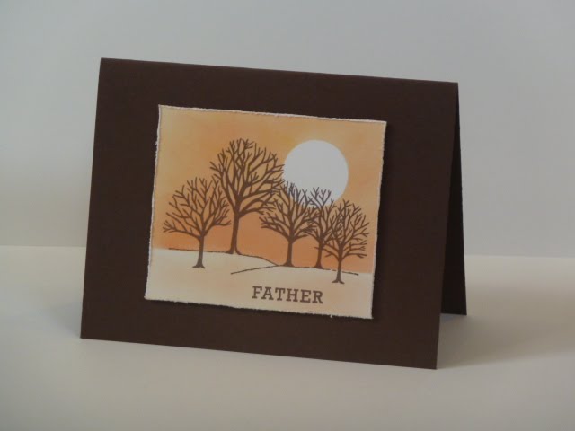
For this card, I masked a circle and ground and then sponged yellows and oranges across the sky. I stamped my trees in brown and added a touch of color to the ground. I really couldn't decide exactly what to do with the ground. I tried some darker colors and shadows, but wasn't pleased with the results. If anyone has suggestions, I'd love to hear them! :)
I wanted to give it a little button and twine treatment, but alas I have no twine and ribbon seemed too girly. I think a shopping trip may be in order. Instead, I used my scissors to distress the edges of the cream cardstock. It's somewhat hard to see in the picture, but I really do like the roughed up edges. I popped the image up on pop dots. I tried several placements, as pictured below, but I think I prefer the one above.


Supplies:
Stamps: Rubber Stampede Winter Trees, PTI Mega Mixed Messages
Ink: Memento Rich Cocoa, ColorBox Paintbox Brights
Paper: PTI dark chocolate, vintage cream
This is just brilliant
ReplyDeleteLove the effect of the moon with the sponging
Thanks so much, great to see you
mandi
"Less is More"
I always love the scene cards and this one so no exception, it's brill!
ReplyDeleteKelly xx
www.kellyscraftincorner.blogspot.com
Wow that moon was here the other night, makes a great card, love how you have done it.
ReplyDeleteThis is fabulous, I love it! xx
ReplyDeleteLovely card, stamped image is fab as is your sponging.
ReplyDeleteBeautiful card! Perfect for a man. Lynne x
ReplyDeleteI think this is a great image and very suitable for a masculine card. I love the way you've masked ares out before shading. Love the distressed edges too. Alas I have no tips for the foreground, I have a similar stamp and it doesn't get used much for the same reason. It's finding a way to make shadows isn't it :)
ReplyDeleteThese are great guy's cards. I think trees work really well and I love the treatment you ave given them on these cards.
ReplyDeleteThe distressing is fab and as for placement... I rather like the last one... off centre really seems to work!
Thanks for a super submission!
Chrissie
"Less is More"
really like these cards. lovely
ReplyDeleteI really like them all but the middle one is actually my favourite,but that aside you have made an excellent choice for a man's card. The colour and theme are great and the design is perfect.
ReplyDeleteDiane x
I love them all too but for me the last one is the best layout..
ReplyDeletekerry x
A wonderful scene, the tree image is very popular for men, and I don't seem to have a manly one in my collection - I have a flouncy girly one instead lol! As for placement, they all work beautifully, but my personal favourite is the middle card, I think the image looks great higher up, but they all work fabulously xx
ReplyDeleteThis card is fabulous. I love it, great colouring and the moon looks great. Jo x
ReplyDeleteOh yes, for me the first one but it is all about personal choice isn't it? Lovely card btw and very masculine
ReplyDeleteKathyk
lovely card, peaceful. great job!
ReplyDeleteBrilliant card. I love the design and the colors! Beautiful!
ReplyDeleteAleksandra
I like your top one. Love your sponging. x
ReplyDeleteBrilliant sponging and masking, well done. I prefer the top card, but only by a small margin as BOTH are great.
ReplyDeleteHugs, Sandra
Hi
ReplyDeleteFabulous card ...i love it ...
hugs
sylvie
xx
Liking all three of your fab cards, there's not much in it but i think i like the top one best. Fantastic colours and great sponging:-)
ReplyDeleteI think "nature" cards are perfect for the guys! Love the first one the best too. Distressing the edges looks great...don't worry about adding anything else...it's perfect!
ReplyDeleteWonderful card
ReplyDeleteHug Sylvie x
This is just perfect, lovely the rich brown colours you have used. Thank you for commenting on my blog :)
ReplyDeleteSonia xx
Hi there, I'm sorry I don't know how I missed your cards, these are lovely, great masking and sponging and lovely colour choice. Have a lovely weekend:0) xxx
ReplyDelete